In this article, we will learn how to create a mobile-friendly website. It also includes worthwhile stats and best practices that will ensure your site gives a good mobile experience.
Understanding Mobile-Friendly Websites
What is a Mobile-Friendly Website?
A mobile-friendly website is meant to offer tablets and smartphones the best viewing experience. It changes site structure, text, images, and navigation to fit smaller displays so visitors may quickly read and engage with the site without having to scroll horizontally or zoom in.
Mobile-Friendly vs. Mobile-Responsive

Although people use the terms “mobile-friendly” and “mobile-responsive” interchangeably, there is a big difference between them:
- Mobile-Friendly: The design does not change but works well on mobile. Content shrinks to fit smaller screens.
- Mobile-Responsive: The design is mobile responsive, meaning it automatically adjusts depending on the screen the user is using.
Why Mobile-Friendliness Matters?
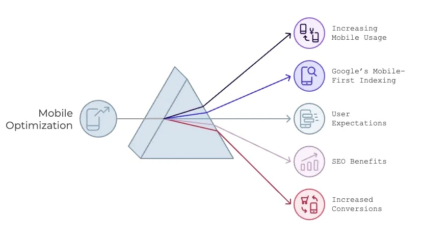
1. Increasing Mobile Usage
Mobile device usage has skyrocketed over the past decade. As Statista points out, 2023 was huge for mobile devices, with an overall traffic of 58.99% of websites.
2. Google’s Mobile-First Indexing
Google searches and ranks using the mobile version of webpages from 2020. Should your website lack mobile-friendliness, your SEO can suffer.
3. User Expectations
Our fast screens, touch interfaces, and attractive image demand also apply to our mobile devices. In around 3 seconds, 53% of visitors will drop off a website (Google).
4. SEO Benefits
Google indexes those sites whose Content is mobile-friendly. You can improve your Core Web Vitals for page speed, interactivity, and stability if you have a well-optimized mobile site. This increased performance can lead to better visibility in the search results. An improved mobile experience lowers the bounce rate and enhances dwell time—key factors for SEO success.
5. Increased Conversions
Over 60% of web traffic goes online using a mobile device, so they expect a convenient experience. Having a seamless mobile experience can better conversion by smoothening the activity of buying, filling forms, or clicking CTA buttons. Upgraded checkout processes and responsive designs help reduce cart abandonment, which translates to more sales and leads.
Businesses that optimize for mobile see a 15-20% increase in conversion rates (Think with Google).
Key Features of a Mobile-Friendly Website
Any website these days must be mobile-friendly. These are the key characteristics:
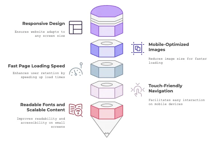
- Responsive Design
A responsive layout makes sure your website automatically fits any screen size. A responsive design includes flexible grids, images, and CSS media queries to create a fluid layout.
2. Mobile-Optimized Images
Large images that aren’t optimized can slow down your site, which annoys users and hurts your SEO. Use image compression tools and modern formats like WebP to reduce file size without sacrificing quality.
3. Fast Page Loading Speed
Slow-loading pages drive users away. Tools like Google PageSpeed Insights can help you identify issues and suggest improvements like enabling browser caching, minifying CSS, and reducing server response times.
4. Touch-Friendly Navigation
Buttons, menus, and interactive elements should be large enough to tap easily without zooming in. Avoid placing links too close together.
5. Readable Fonts and Scalable Content
Ensure your fonts are large enough to read on a smaller screen and that there is enough contrast between text and background for accessibility.
| Example: Airbnb is mobile-friendly, with large buttons, easy navigation, and low loading times. |
6 Steps to Create a Mobile-Friendly Website
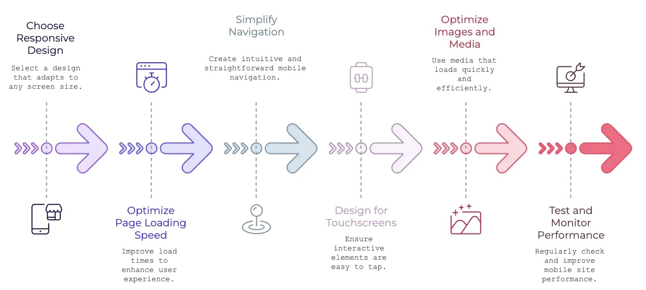
Step 1: Choose a Responsive Design
A responsive design ensures your site adapts to any screen size. Most modern website builders and CMS platforms like WordPress, Wix, and Squarespace offer responsive templates.
Example:A local bakery made a beautiful site using Squarespace’s responsive templates. Their site looks lovely on the desktop and cell phone.
Expert Tip: Test your site’s responsiveness with Google’s Mobile-Friendly Test Tool.
Step 2: Optimize Page Loading Speed
Slow-loading websites drive users away. According to Google, a 1-second delay in load time can reduce conversions by 7%.
How to Improve Speed:
- Compress images using tools like TinyPNG or ImageOptim.
- Minimize CSS, JavaScript, and HTML using tools like Minify.
- Enable browser caching.
- Use a Content Delivery Network (CDN) for faster global delivery.
| Example: An e-commerce store reduced image sizes and implemented a CDN, decreasing load time by 2 seconds and boosting mobile sales by 18%. |
Step 3: Simplify Navigation
Mobile users need intuitive and straightforward navigation. Implement a hamburger menu or sticky header for easy access.
| Example: The mobile website of Amazon features a sticky navigation bar that links the cart, account, and search in addition to effortless browsing between sections. |
Step 4: Design for Touchscreens
Ensure all interactive elements are easy to tap without accidental clicks.
Best Practices:
- Buttons should be at least 48×48 pixels.
- Add ample spacing between clickable elements.
- Use larger fonts (minimum 16px) for readability.
| Example: A fitness studio redesigned its mobile booking page with larger buttons, increasing appointment bookings by 25%.. |
Step 5: Optimize Images and Media
Heavy media files can slow down your site and disappoint users.
Best Practices:
- Use images that automatically resize for better viewability.
- Suggests using lazy loading for images not currently on screen.
- Convert images to modern formats like WebP.
| Example: A food blog reduced its high-resolution images for mobile devices, resulting in a 15% drop in bounce rates. |
Step 6: Test and Monitor Performance
Regularly test your site to identify and fix mobile-specific issues.
Tools to Use:
- Google PageSpeed Insights: Analyze load speed and performance.
- BrowserStack: Test your site on different devices and browsers.
- Hotjar: Monitor user behavior on mobile.
Top Tools and Platforms for Building Mobile-Friendly Websites
Using Mobile-Responsive Frameworks
Frameworks like Bootstrap and Foundation offer pre-built responsive components, making it easier to create mobile-friendly designs.
Testing for Mobile Compatibility
Use tools such as Google’s Mobile-Friendly Test, BrowserStack, or Responsinator to ensure your site functions well across different devices and browsers.
SEO for Mobile Websites
Implement mobile SEO strategies like optimizing for local search, focusing on mobile-first indexing, and using structured data to improve search visibility.
- WordPress: Offers responsive themes and mobile-optimization plugins like WP Rocket.
- Wix: Drag-and-drop builder with built-in mobile design customization.
- Shopify: Ideal for e-commerce sites with responsive themes and mobile checkout.
- Squarespace: Known for stunning, mobile-responsive templates.
Benefits of a Mobile-Friendly Website
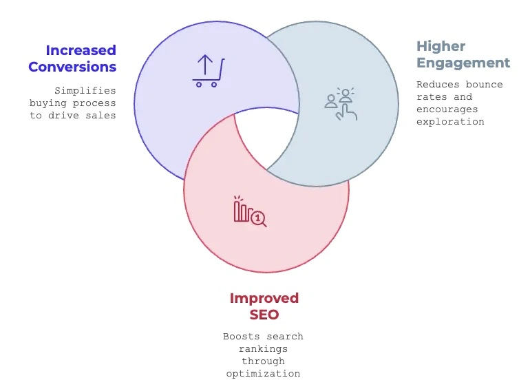
- Higher Engagement: Mobile-friendly sites reduce bounce rates and encourage exploration.
- Improved SEO: Google prioritizes mobile-optimized sites, boosting search rankings.
- Increased Conversions: Mobile-friendly designs simplify the buying process, driving sales. Mobile-friendly websites generate 67% more leads than non-optimized sites (Search Engine Land).
Best Practices for Mobile-Friendly Websites
- Prioritize Content Above the Fold: Display important information first.
- Use Finger-Friendly Buttons: Ensure buttons are easy to tap, with enough spacing around them.
- Simplify Forms and Checkout Processes: Reduce the number of fields and steps to improve conversions.
Case Studies: Successful Mobile-Friendly Websites
Examples of successful mobile-friendly websites like Amazon and Airbnb show how responsive design and mobile optimization lead to higher user satisfaction and business growth..
Frequently Asked Questions (FAQs)
What is the easiest way to make my website mobile-friendly?
How does mobile-friendliness affect SEO?
What tools can I use to test mobile-friendliness?
Should I create a separate mobile site or use a responsive design?
How do I improve my site’s loading speed on mobile?
What are some common mistakes to avoid?
The Bottomline
Make sure your fonts are readable on smaller screens, and that text and background contrast enough to be accessible.
For instance, Airbnb’s website loads quickly and features big buttons, simple navigation, and easy adjustment for mobile screens.
Begin optimizing your website with the methods and tools mentioned in this guide today. A mobile-friendly site isn’t a privilege or an option. Today’s world demands that every brand, organization, or company create a website that’s mobile-friendly.