This guides the psychology of color, branding effects, and practical examples supported by relevant research outcomes.
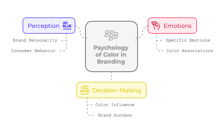
Why Color Matters in Branding
Color is not just something that looks beautiful – it also has the power to influence thoughts, emotions, and even behavior. In business branding, how a brand connects with the audience can be determined by the strategic use of color.
Colors do not just catch the eye; they shape perceptions and decisions. According to Colorcom, 92.6% of people say visual factors, including color, are the primary influence when purchasing.
Key Impacts of Color in Branding:
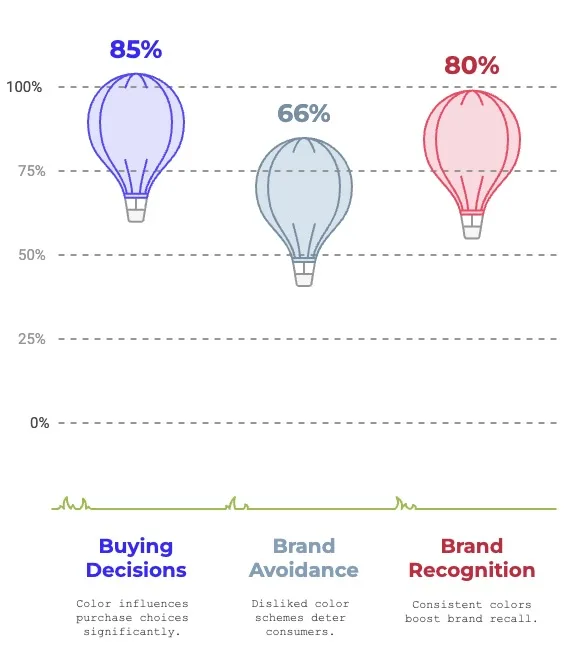
- Establishing Recognition: Consistent use of brand colors increases recognition by up to 80% (University of Loyola).
- Emotional Impact: Colors trigger different emotions and connotations. 66% of consumers avoid brands if they dislike the color scheme (Study by Reboot).
- Driving Conversions: 85% of consumers say color influences their purchasing decisions (Kissmetrics).
| Example: Coca-Cola’s red triggers excitement and energy, aligning with the brand’s lively and sociable personality. |
The Science of Colour Psychology
Colors are more than visual stimuli; they influence how people feel and behave. It has been proven that colors can evoke specific emotions, and marketers and designers use this to their advantage in creating powerful branding.
In its historic sense, color psychology has roots in ancient practices. Medical practitioners used colors in art and medicine, believing colors had healing properties. Today, psychologists and neuroscientists study how colors influence mood and decision-making.
The Psychology of Popular Colors in Branding
Each color has a specific set of meanings and provokes definite feelings. Here’s how some of the most frequently used branding colors work out:
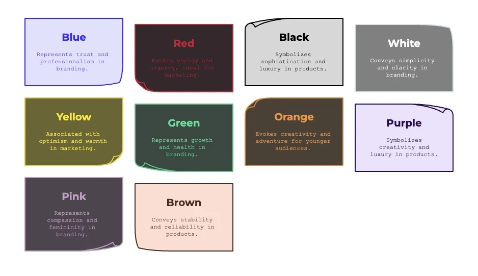
1. Blue: Trust, Professionalism, and Security

Blue is the most universally preferred color, favored by 57% of men and 35% of women (Joe Hallock). Blue is also used by 33% of the world’s largest brands.
- Emotions Evoked: Trust, dependability, and calmness.
- Common Uses: Tech, finance, healthcare.
| Example: Facebook, PayPal, and IBM use blue to communicate trustworthiness and reliability. |
2. Red: Energy, Passion, and Urgency
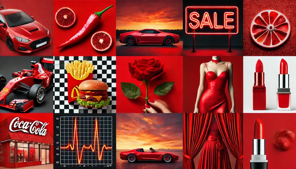
The color Red, the second most popular color used in branding, can raise your heart rate and give a rush of urgency. Red, used by 29% of the world’s largest brands, is good for calls-to-action in marketing. Surveys shows that excitement, passion, energy, and urgency are the emotions evoked.
- Common Usage: Sales offers, food brands, or entertainment-related products.
| Example: McDonald’s uses red to stimulate hunger and emit energy. |
3. Black: Sophistication, Luxury, and Power

Black appeals to consumers who want exclusivity and sophistication; therefore, it is used for many high-end products. Black and its derivates, Grey and Silver, account for 28% of the world’s largest brands, making them the third most popular colors.
- Emotions Evoked: Elegance, power, and exclusivity.
- Common Uses: Luxury brands, tech, fashion.
| Example: Chanel and Apple use black for a sleek, modern image. |
4. White: Simplicity, Purity, and Minimalism

White is often used to create space and clarity, making it a top choice for minimalist and luxury branding. White’s universality features make it the most frequently used secondary color in logos across most sectors.
- Emotions Evoked: Cleanliness, peace, and simplicity.
- Common Uses: Healthcare, technology, and high-end fashion.
| Example: Apple and Tesla use white to emphasize modernity and innovation. |
5. Yellow: Optimism, Happiness, and Warmth
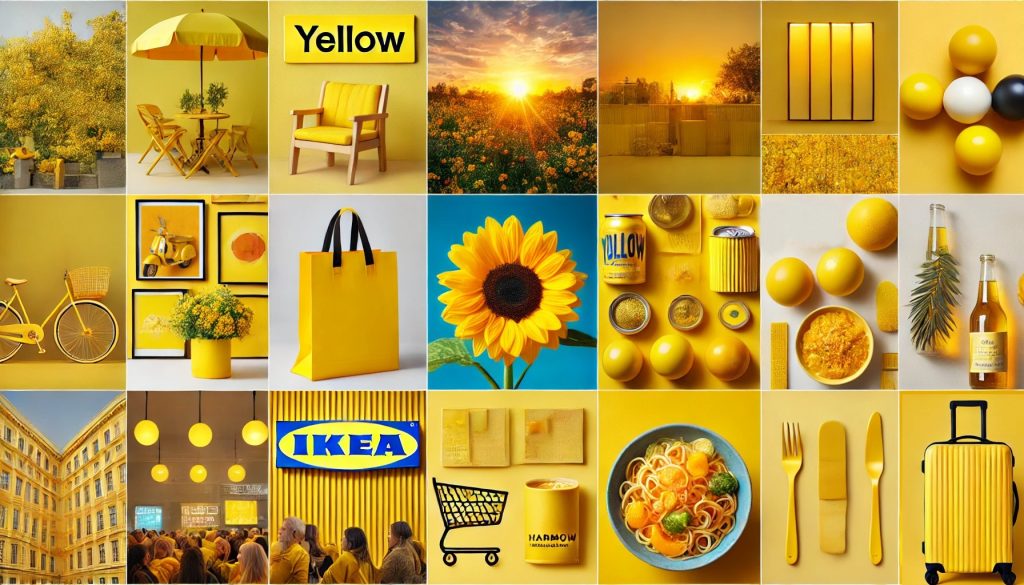
Yellow draws a crowd faster than any other colour; therefore, it should be utilized on signage and signboards. Yellow is used by 13% of the world’s largest brands
- Emotions Evoked: Happiness, positivity, and energy.
- Common Uses: Retail, food, and travel.
| Example: Ikea and McDonald’s are using yellow for warmth and friendliness. |
6. Green: Growth, Health, and Harmony

Green is related to better reading ability and lesser eye strain. It is thus a soothing color for branding.
- Emotions Evoked: Nature, freshness, and prosperity.
- Common Uses: Health, environment, finance.
| Example: Whole Foods uses green to emphasize its commitment to health and sustainability. |
7. Orange: Creativity, Confidence, and Adventure
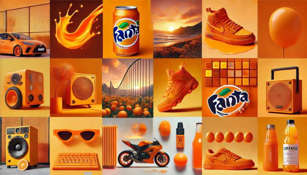
Orange can evoke excitement and motivation, making it perfect for targeting younger viewers.
- Emotions Evoked: Excitement, confidence, and playfulness.
- Common Uses: Technology, food, and entertainment.
| Example: Fanta and Nickelodeon Orange as a symbol of creativity and energy. |
8. Purple: Creativity, Wisdom, and Luxury
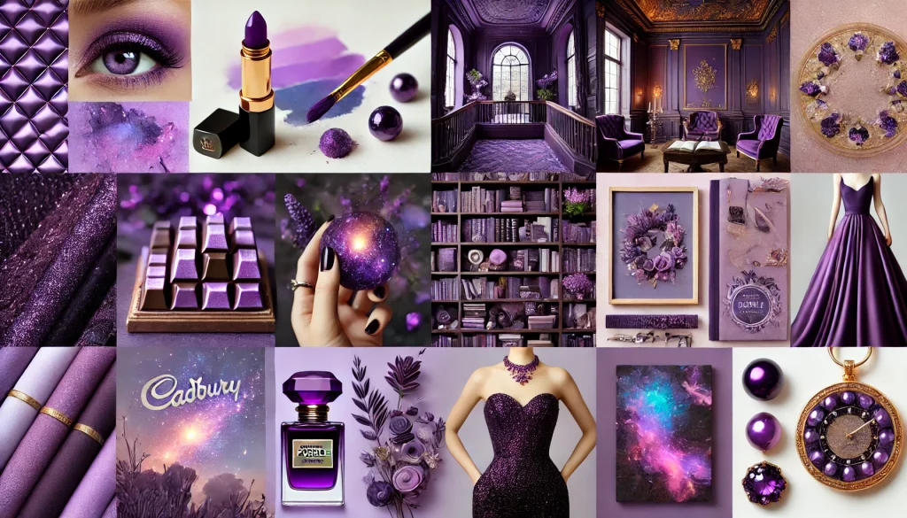
Purple is attractive to 75% of pre-adolescent children, so it’s a popular color for products aimed at younger audiences.
- Emotions Evoked: Royalty, divinity, artistry.
- Common Uses: Beauty, luxury, and education.
| Example: Cadbury and Hallmark use purple as a color for sophistication and indulgence. |
9. Pink: Compassion, Femininity, and Playfulness
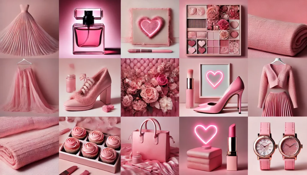
Pink is often associated with emotional connection and can create a sense of comfort. It is an excellent choice for brands targeting a soft, friendly, or romantic appeal.
- Emotions Evoked: Love, gentleness, and warmth.
- Common Uses: Beauty, fashion, and wellness.
| Example: Victoria’s Secret and Barbie use pink to symbolize femininity and playfulness. |
10. Brown: Stability, Earthiness, and Reliability
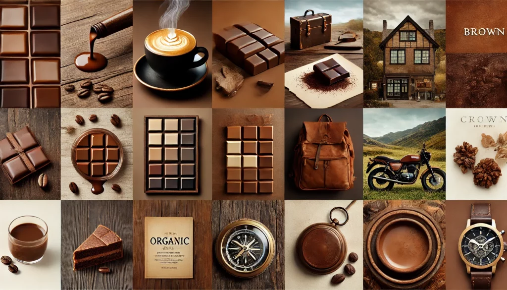
Brown is associated with comfort and dependability, making it a powerful choice for brands that want to emphasize trust and authenticity.
- Emotions Evoked: Warmth, security, and wholesomeness.
- Common Uses: Coffee, organic products, and heritage brands.
| Example: UPS and Hershey’s use brown to evoke reliability and tradition. |
How to Use Color Effectively in Your Branding
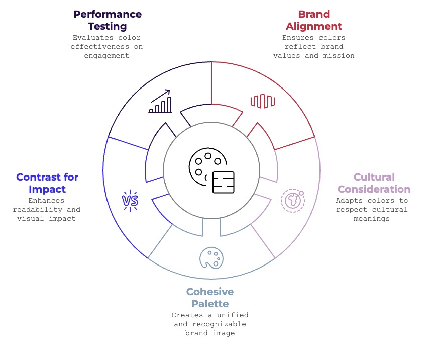
1. Align Colors with Brand Personality
Your brand colors should reflect your business’s mission and values.
| Example: A wellness brand might choose green and white to represent health and simplicity, while a tech startup may use blue and black for professionalism and innovation. |
2. Consider Cultural Differences
Colors mean different things across cultures. For example, white signifies purity in Western cultures but mourning in some Asian traditions. Brands aiming for global reach must tailor their color strategies to respect cultural differences.
| Example: In Western cultures, white symbolizes purity, while in Eastern cultures, it can signify mourning. |
3. Create a Cohesive Color Palette
Use a primary color for recognition and secondary colors to complement and balance.
| Example: Spotify uses green as its primary color, supported by black and white for contrast and clarity. |
4. Use Contrast for Readability and Impact
Ensure sufficient contrast between colors to enhance readability and visual impact.
| Example: Netflix uses red and black for a bold, high-contrast look. |
5. Test and Analyze Performance
Conduct A/B tests to evaluate how different color schemes affect audience engagement and conversions.
| Example: HubSpot increased conversions by 21% after testing a green call-to-action button against a red one. |
Mistakes to avoid in Color Branding
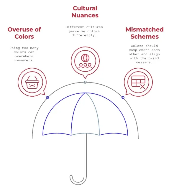
- Overuse of Colors: Too many colors can overwhelm and confuse consumers.
- Ignoring Cultural Nuances: Be mindful of how different cultures perceive colors.
- Mismatched Schemes: Colors should complement each other and align with the brand message.
The Future of Color in Branding
The trends now are dynamic colors which change as users’ preference dictate, augmented reality applications redefine the way customers see colors. Technology will continue to shape the way brands use color to connect with audiences.
FAQs on Branding Colours
Why is color important in branding?
What colors are best for trust?
Can color influence purchasing decisions?
How do I choose the right color for my brand?
What role does culture play in color perception?
What tools can help with color branding?
The Bottomline on the Psychology of Color
Business branding through the psychology of color is a tool that can provide an invigorating influence on consumer perception and emotional connection while fueling purchasing behavior. Understanding the impact of colors and using them strategically will facilitate such connections, you can craft a memorable and impactful brand identity. Whether you’re launching a new business or rebranding an existing one, let the science of color guide your creative decisions.
Start small, experiment, and always consider your audience—your colors might be the key to standing out in a crowded market.